Joint Presentation of Gender and Family Status
Presentation of the data in both sections (i.e, gender and family status) can be combined. While we previously examined the distribution of family situation among all employees in the office, we will now examine the distribution of family status separately for males and females in the office.
The frequency table for family status among males only is as follows:
|
Value (Family Status) |
Frequency |
Relative Frequency |
|
Single |
2 |
25% |
|
Widower |
0 |
0% |
|
Divorced |
1 |
12% |
|
Married |
5 |
63% |
|
Total |
8 |
100% |
|
Value (Family Status) |
Frequency |
Relative Frequency |
|
Single |
4 |
18% |
|
Widow |
1 |
4% |
|
Divorced |
3 |
14% |
|
Married |
14 |
64% |
|
Total |
22 |
100% |
These two frequency tables can be presented as a single table as follows:
|
Value (Family Status) |
Among Males |
Among Females |
||
|
|
Frequency |
Relative Frequency |
Frequency |
Relative Frequency |
|
Single |
2 |
25% |
4 |
18% |
|
Widow/er |
0 |
0% |
1 |
4% |
|
Divorced |
1 |
12% |
3 |
14% |
|
Married |
5 |
63% |
14 |
64% |
|
Total |
8 |
100% |
22 |
100% |
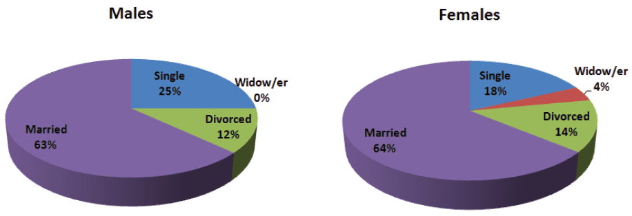
It is easy to see that the distribution of marital status among males in the office is quite similar to that of the females. For example, those who are married constitute a majority among both males (63%) and females (64%).
We can compare the diagrams of the two distributions, and also obtain a visual impression of the similarity.
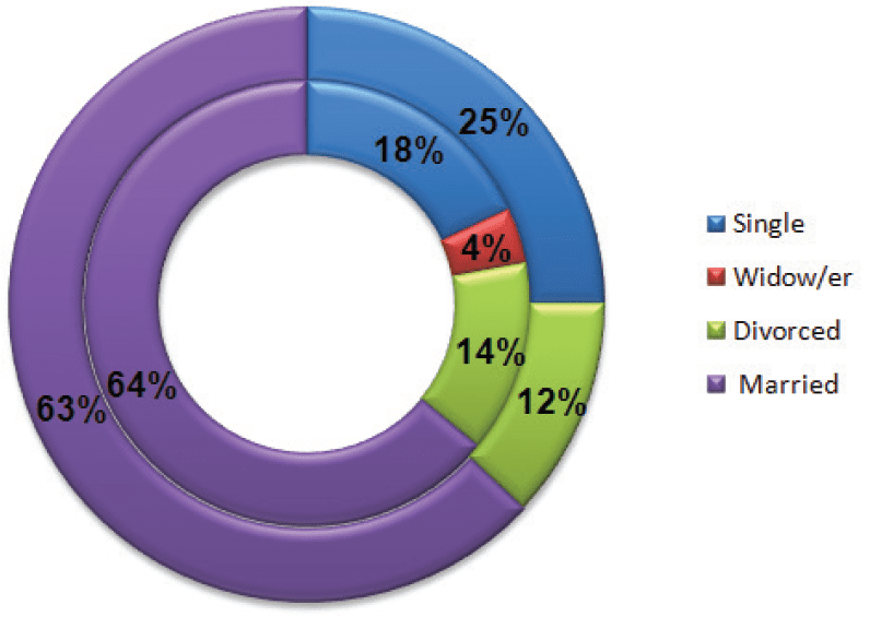
We sometimes present such a comparison through a ring diagram rather than through two pie charts:

-
Males – external ring.
-
Females – internal ring.
After we have organized the data in a table, we can present the distribution of marital status by using a pie chart.
This time, the pie will have four “slices”.


