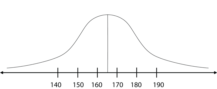
There are many different probability distributions, though some are more useful and popular than others. The normal distribution is the most frequently used probability distribution. You have probably seen this familiar “bell curve” sketched in illustrations or have heard it discussed as a “standard normal” or “Gaussian” distribution. Its popularity is well-deserved since the normal distribution can often model the outcomes of sampling accurately.

Histogram Graph and Normal Curve
The graphic expression of a continuous variable is a histogram. Consider the following histogram, which describes the results of a sample of people’s heights. Every rectangle in the histogram represents a height group, which is called a division. Each division includes people whose heights vary between the values marked at the ends of the rectangle.
Histogram

The width of each division in this histogram is 10 centimeters. For a larger sample, we usually choose narrower divisions, for example 5 centimeters.
The larger the sample, then the more divisions we separate the results into, and the narrower the internal rectangles in the histogram. The height of the steps of the external edge of the histogram also becomes smaller, and the histogram resembles the teeth of a miniature saw.
The external edge of the histogram
When the sample includes an “infinite” number (or, in real terms, a very large number) of observations, the external edge gradually becomes a smooth and continuous curve.
Diagram

This histogram is called a Gauss Bell due to its shape, and it was developed by the German mathematician, Karl Friedrich Gauss (1777-1855).
The Gauss Bell histogram describes the normal probability distribution, and is therefore also called the normal curve.


