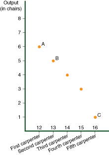
The diagram illustrates the daily output of five carpenters in descending ordaer, from the most to least efficient. The output of each carpenter is measured in terms of the number of chairs produced per day:
Mouseover points A, B and C on the graph for explanations.
-
Point A displays the first carpenter (the most efficient worker), who makes six chairs a day.
-
Point B displays the second carpenter, who makes five chairs a day.
-
Point C displays the last carpenter (the least efficient worker), who makes one chair a day.
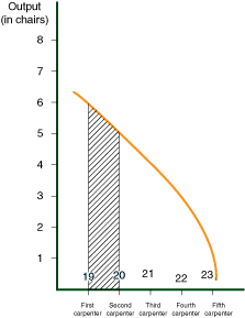
Although this sketch is made up of individual points plotted upon a graph, when connected these points nonetheless create the downward sloping curve shown in the following diagram.
In this graph, the area between each carpenter holds no meaning. Using a downward sloping curve, however, we can illustrate the general concept that output by each successive carpenter declines. The curve in the following diagram illustrates this fact much better than the previous diagram.
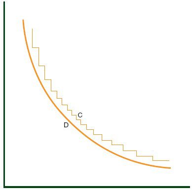
No Need for Accuracy
A curve drawn with great accuracy might look like curve C, but such precision is unnecessary.
Such a curve relates to a specific situation, while we are only interested in general circumstances.
Instead of curve C, which is snake-shaped, we will therefore present smooth curves like D (and this will apply both to convex and concave curves).
Freehand Drawing of Curves
The curves depicted in this course were not derived from formulas or calculations. All of them were drawn freehand. Some may appear steeper or in some other way different from the others. Certain features will depend upon the preferences of the graphic artist, and not upon any specific theory or calculation.


