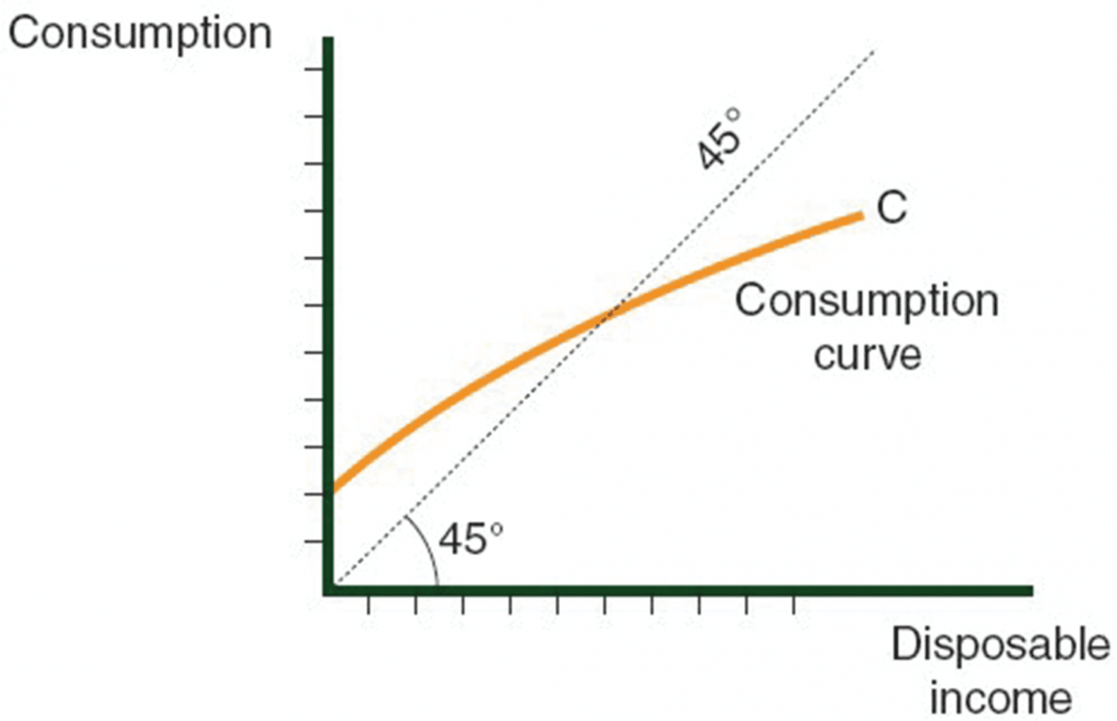
The division of disposable income between savings and consumption can be illustrated using a consumption curve. The following diagram shows an example.
Structure of the curve:
The X-axis indicates disposable income.
The Y-axis indicates the amount of money spent on consumption.
Elements on the graph:
-
A diagonal line from point 0, running upward at a 45-degree angle, which serves as a guideline for our analysis.
-
A curve, usually convex, begins on the Y-axis with a quantity greater than 0. This curve is symbolized by the letter C for Consumption.


Every point on the graph corresponds to two numbers:
-
Disposable income (on the X-axis).
-
Amount of consumption (on the Y-axis).
-
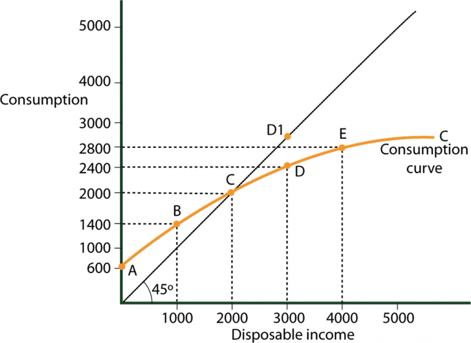
Point E shows that if disposable income is $4,000, the family will use $2,800 for consumption and put $1,200 into savings.
-
Point D shows that if disposable income drops to $3,000, the family will use $2,400 for consumption and put $600 into savings.
-
Point C shows us that if disposable income is $2,000, the Reading family will use all of its $2,000 for consumption.
-
Point B is more interesting. It shows us that even if its disposable income is only $1,000, the family will still use $1400 for consumption.
Two sources can be used to cover the excess of consumption over income
1. existing savings.
2. taking out a loan.
-
Point A shows that even if the family has no disposable at all, it will still use $600 for consumption. People still have to eat, even if they have no disposable income.
Using the Diagonal Curve as a Guideline
Every point on the diagonal line corresponds to two numbers: Disposable income, and the volume of consumption.
Essentially, the diagonal line presents a scenario in which all disposable income is spent on consumption.
In other words, consumption equals disposable income at every point on the diagonal line.
Distance Between the Curve and the Diagonal Guideline
At any level of disposable income, the distance between Curve C and the guideline represents the amount of money deposited as savings. For example: At point D, the disposable income of the family is $3,000, of which $2,400 is used for consumption and $600 is deposited as savings. Had the family used all of its income for consumption, then the curve would have reached Point D1 instead of D. The money not used for consumption was therefore deposited as savings.
Negative Savings
When the family spends more than its disposable income, we say that it has negative savings.
The family must either take out a loan or use existing savings in order to continue consuming.
Points A and B correspond to situations with negative savings.
Savings and Consumption Table
We can list the information shown on a consumption curve in a table. In many cases, the table is prepared before the consumption curve is drawn.
Savings and consumption table for the Reading family
|
Income Column 1 |
Consumption Column 2 |
Savings Column 3 |
|
$0 |
$600 |
-$600 |
|
$1,000 |
$1400 |
-$400 |
|
$2,000 |
$2,000 |
$0 |
|
$3,000 |
$2400 |
$600 |
|
$4,000 |
$2800 |
$1200 |
|
$5,000 |
$3,000 |
$2,000 |
Movement along the Consumption Curve
Whenever its income level changes, a family moves to a different point on its original consumption curve.
Changes in income can be the result of many factors, including:
-
Salary increases.
-
Winning the lottery.
-
An inheritance.
-
An increase or decrease in taxation.
Shifting of the Consumption Curve
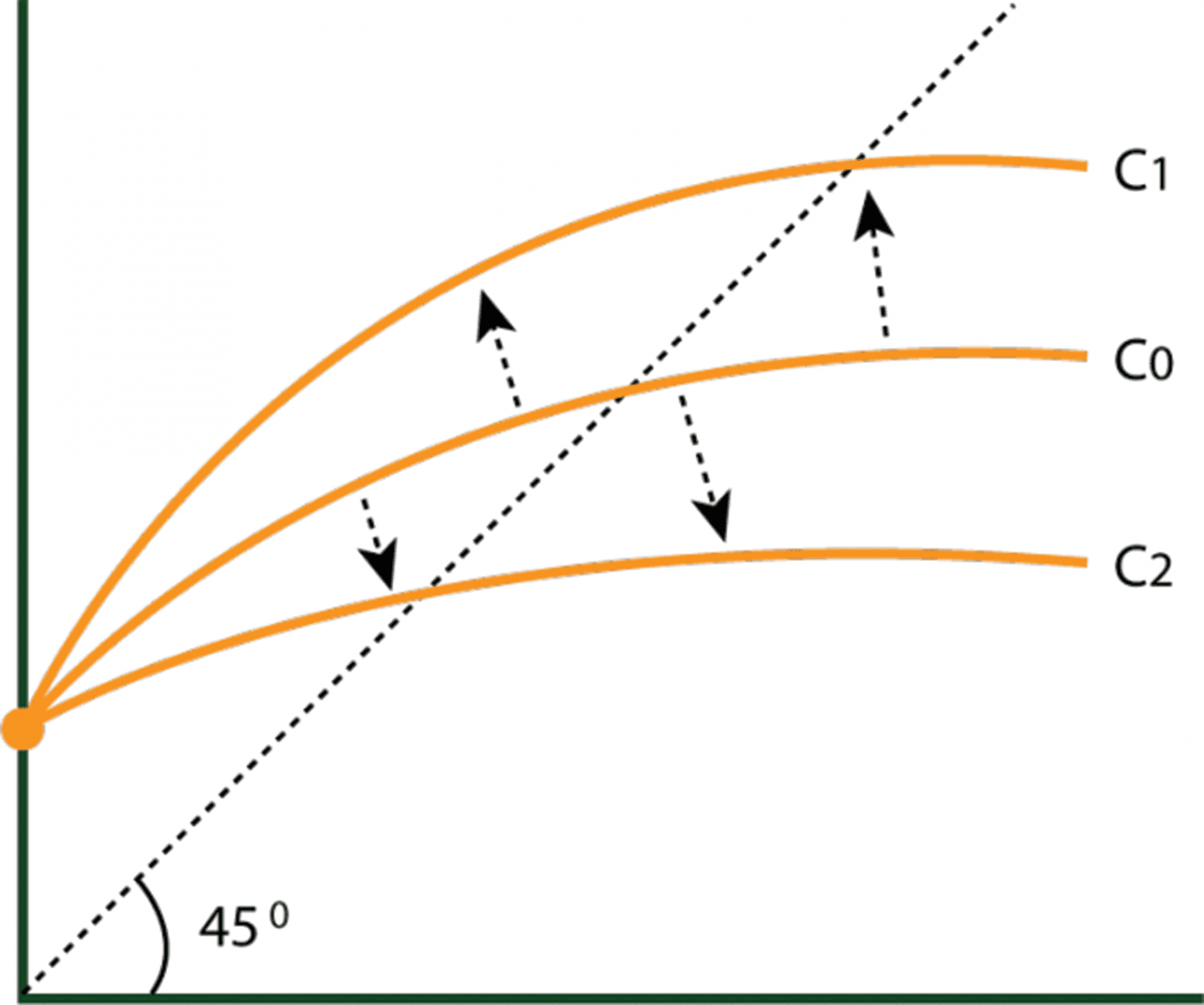
When consumption and savings priorities change, then the existing curve is no longer relevant and a new one is drawn in its place. The following diagram portrays a shift in the consumption curve:
Shifts in the consumption curve

-
If more goods are consumed, then the new consumption curve (C1) will be above the original (C0).
-
If more money is saved , then the new consumption curve (C2) will be less than the original (C0).


