Lorenz Curve
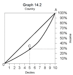
The Lorenz curve shows in graphic form the degree of inequality of incomes of the residents of a country. Each point on the curve relates to two pieces of data, one of which is the income of the residents and the other the division of the population into deciles, in accordance with their level of income.
The income details are shown on the vertical axis, in ascending order, from bottom to top, from 10% (of total income in the country) to 100% (of total income in the country). The decile data are shown on the horizontal axis, in ascending order from left to right, from the first decile (the poorest) to the tenth decile (the richest). Each point on the curve shows the cumulative share of incomes in the country of the decile appearing vertically below the point, together with the incomes of all the deciles poorer than it.
Up until, this has all been rather complicated, and from now on it becomes simple.
For example: Point C on  shows that the cumulative income of all of the first five deciles together comprises less than 30% of total incomes in the country.
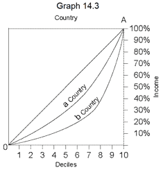
In general, the further the curve is away from the diagonal line AO, the greater the degree of inequality.
When the curve lies on the diagonal line AO, this means that there is absolute equality of incomes. That is: each decile receives exactly 10% of incomes in the country. In graph 14.3,the Lorenz Curves in two countries are shown, in country a and in country b. In country b the level of inequality is greater.


