As previously explained, it is always possible to calculate the annualized yield to maturity of any bond until its maturity date. (Reminder: The yield represents the average annual profit until maturity.)
Calculation of the yield is based on the particulars of the bond (annual interest, maturity date, etc.) and the bond’s price on the calculation date. Usually, in terms of a group of bonds with identical characteristics, the yield will be higher for bonds with later maturity dates.
Example
-
A bond reaching maturity in one year will generate a yield of 3%.
-
A bond reaching maturity in five years will generate a yield of 4%.
-
A bond reaching maturity in 10 years will generate a yield of 5%.
-
A bond reaching maturity in 30 years will generate a yield of 6%.
As explained above, the risk affects the interest rate; for bonds, the most important consideration is the yield, and not the interest rate. An increase in risk affects the increase in yield. Similarly, the time element affects the yield since the later the maturity date, then the greater the concern that the bond will not be paid and that the federal interest rate may rise. Investors therefore require compensation in the form of a higher yield. This is also true in the case of government bonds.
The yield curve displays how the yields of bonds vary at any given point in time as their maturity dates approach. The bonds to which the yield curve relates must be of the same type (i.e., having identical characteristics). There is no point comparing bonds of different types since it is like comparing apples and oranges.
In order to chart the yield curve, all of the bonds in a given group are divided into subgroups according to the length of time remaining until their maturity dates. The yield is examined for each subgroup.
Example:
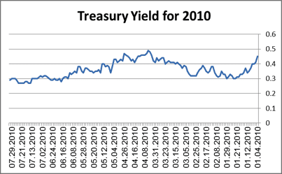
The following diagram presents a yield curve of government bonds as of 2010:
-
The Y-axis (vertical axis) represents yield.
-
The X-axis (horizontal axis) represents time until maturity.
Diagram 1.8 – US Treasury Yield Curve

[The points on the graph should be adjusted according to the following sketch]
Under normal economic conditions, the yield curve rises from left to right although not usually in a straight line, which means that the yield increases as the number of years until maturity increases.
When the graph does not increase from left to right, there is usually an economic distortion at a specific point for some reason, which will almost certainly be corrected through market forces (i.e., usually within a few months, although sometimes it can take several years). As stated above, every yield curve relates to a specific date.


